R.A.D. Day

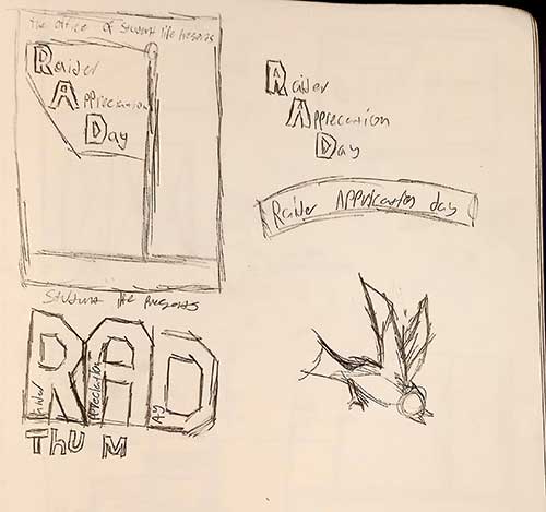
Before I did any thing I wanted to expiriment with different layouts and graphics. I wasn't really sure what to do at this point.
After expirimenting I decided to pick the bottom left sketch to base my 1st draft off o. At this point I still had a long way to go. There just wasn't anything that interesting here. I also didn't have all the information I needed and I knew that'd they'd tell me to add more so I needed to make space.
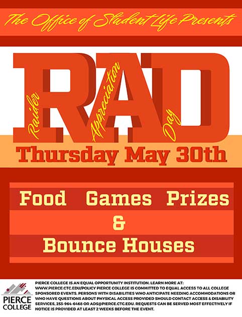
The first thing I did was soften most of the colors so more attention would be draw toward the RAD part. I added the yellow lined to it because without it the different length words made it look unbalanced. I put the words on the logo in a stair formation to draw the eye down the page. I also added that text to the bottom left. I made the lines alternate in color so that the text wouldn't blend together. I also made space for the things I knew they'd tell me to add later, even though I wasn,t sure what they,d be.
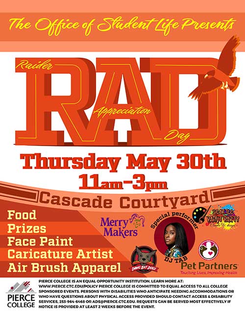
This is the version of the flyer we ended up using. I was givin the list of venders the day before the event and put them on the poster. The bird was a requirment by my boss so I moved to to make space. I put orange behind the bird so it'd stand out.